This movie was produced using my current favourite quick and dirty technique of exporting a sequence of jpeg images directly from a Revit shaded walkthrough view and compositing / editing them together using Adobe After Effects - music courtesy of YouTube AudioSwap feature..
Thursday, 6 October 2011
Mews Concept
One of the frustrations with architecture and running a blog like this is the fact that we usually can't post images of what we are currently working on due to project or client sensitivities, however I can share this one with you. We've been doing some speculative work along with my builder for a couple of new town houses in a mews style street near Marylebone, London. This is only some rapid concept work to give the end client an idea of what is possible and if the project goes ahead the design will no doubt change beyond recognition..
This movie was produced using my current favourite quick and dirty technique of exporting a sequence of jpeg images directly from a Revit shaded walkthrough view and compositing / editing them together using Adobe After Effects - music courtesy of YouTube AudioSwap feature..
This movie was produced using my current favourite quick and dirty technique of exporting a sequence of jpeg images directly from a Revit shaded walkthrough view and compositing / editing them together using Adobe After Effects - music courtesy of YouTube AudioSwap feature..
Friday, 30 September 2011
Out of the ground.. Finally!
It seems like an age since I last gave an update on the progress of my house build - I guess at this rate I'll never be able to replace Kevin McCloud and Grand Designs..
Part of the reason I've not written anything for a while is that until now there has generally been little to show - groundworks always seem to take an interminably long time to do and with this stage of the project being probably the riskiest it's the bit you want over and done with and forgotten as soon as possible! We've had the odd problem and a sleepless night or two but with a scheme such as this where we are literally building out the entire site you really have to expect a little difficulty along the way. Well we've got through it and finally the floor structure is down and the bricks are on site so, theoretically at least, the build should really start to fly now..
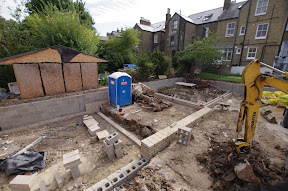
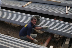
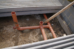
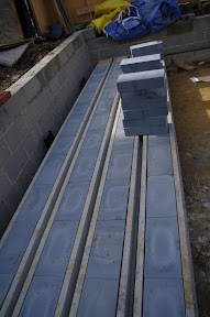
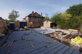
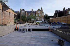
Part of the reason I've not written anything for a while is that until now there has generally been little to show - groundworks always seem to take an interminably long time to do and with this stage of the project being probably the riskiest it's the bit you want over and done with and forgotten as soon as possible! We've had the odd problem and a sleepless night or two but with a scheme such as this where we are literally building out the entire site you really have to expect a little difficulty along the way. Well we've got through it and finally the floor structure is down and the bricks are on site so, theoretically at least, the build should really start to fly now..


Thursday, 22 September 2011
K College Fully Open
 |
| K College main entrance & Media and Arts Centre |
K College was built in two construction phases to an extremely tight budget and programme. Phase 1 opened last summer with two thirds of the total build, and Phase 2 (the final piece) is the part that's just been finished. I have to say I am extremely pleased and excited about the result. Whilst this (phase 2) was the smaller part of construction it provides the majority of the most interesting spaces and makes sense of Phase 1 - turning what was a new building that was surprisingly difficult to understand from within it's corridors, into a complete and very legible campus.
The new courtyard which replaces a 5 storey 60's building brings light and volume to the centre of the college and provides what will surely be a well used social heart. This is unlike the majority of internal atrium or "street" based education schemes of recent years as it is outside in the fresh air!! What I like most about this new courtyard space is that by taking advantage of the natural slope of the site we were able to produce three distinct levels or terraces each of individual character. This breaking up of the space helps create a more human scale and provides the opportunity for various activities to take place simultaneously without interfering with each other too much. I think my favourite terrace is the lowest which is adjacent to the main refectory / cafe and main performance venue - here we provided a spill out area for tables and chairs together with a series of 'elephant' steps to sit on. These steps create a natural amphitheater and the idea is that the college can now utilise this space for outside performances when the weather allows.
Anyway, here are some pictures I took from my visit, I'll leave you to make you own opinions..
 |
| Lowest Terrace with Elephant Seating & Middle Terrace for reading outside Learning Resource Centre (LRC) |
 |
| Middle Terrace with view of curved LRC |
 |
| Lowest Terrace looking towards refectory with cafe breakout |
 |
| Curved timber cladding on LRC |
- Posted using BlogPress from my iPad
Location:Tonbridge, Kent
Monday, 5 September 2011
Architect in the House
One of the best things about leaving a large practice and starting your own is that you get the chance to decide where and in what you want to invest your own time in. When we first started we found it amazing, once left to our own devices, how quickly we were able to meet new people and broaden our network. One of the many ways we decided to do this was through an event called 'Architect in the House' which puts architects together with local people for an initial free consultancy to provide ideas for their house or extension- the 'client' is then expected to make a small donation in aid of the charity 'Shelter' in return.
So far we've provided three consultations for Architect in the House and I have found them all to be immensely enjoyable and rewarding. I have to admit to having experienced an initial feeling of trepidation of what would happen if I arrived and couldn't come up with any good ideas. However, after a relaxed chat followed by a quick measured survey to draw up a base plan from which to work from, the ideas flowed with the clients in a natural way. It has been great to be meeting people in this way and I've found developing designs in these brief encounters as enjoyable as working on concepts for multiple-million pound commercial schemes.
One of the consultations led to a small commission to look further at some options for converting a small bedroom attic space with a low sloping ceiling into a bathroom space. Presenting the ideas back to my client the following week reminded me of one the main reasons I enjoy being an architect. I felt fairly confident in the scheme but the enthusiasm with which it was received was truly gratifying..
 |
| Image produced in Revit showing the proposed converted bedroom attic space |
Thursday, 25 August 2011
Pouring Concrete
If you can't get the concrete mixer quite where it needs to be then here's the solution..
Friday, 12 August 2011
Big, big hole!
Well my house has been on site for just over two weeks now.. It's been quite an emotional time and has felt slightly surreal too. It's amazing how scary it is to start throwing loads of money at the ground.. the works here are by far the most expensive single package of the build and the point at which there is the most risk - but all you really get for it seems to be a big, big hole in the ground.
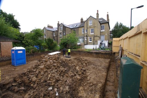
For the most part (touch wood), and considering the complexity of building out to the extremities of the boundary, the ground works have gone smoothly. I did have however have one sleepless night when the council's building inspector spotted three oak saplings which had grown in the neighbour's garden since we originally surveyed the plot at the start of the design right next to where the wall of the new house will be. Unfortunately, when it comes to the structural design of the foundations you have to allow for the effect of any existing tree which isn't to be removed to grow on to be mature. In this case, seeing as the building is on London clay and that the trees were so close to the site, it meant that either the trees had to go or I could pretty much forget continuing with the build unless I had lots of money to throw at piled foundations.. Thankfully I have an extremely understanding neighbour (she is my aunt after all) and so the trees have now gone and building work continues. Phew! But the story just underlines that the riskiest part of the process is in the ground...
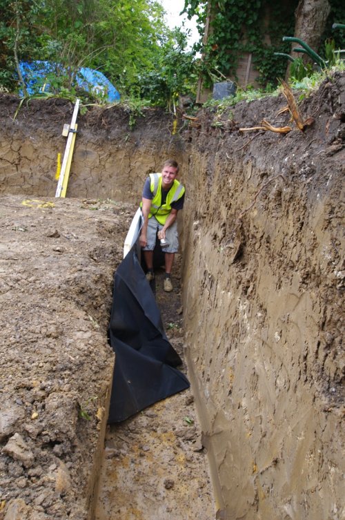
Here's a picture of my Groundworker, Scott, to illustrate the depth the foundations and reduced dig have had to go to in the clay soil..
- Posted using BlogPress from my iPad

For the most part (touch wood), and considering the complexity of building out to the extremities of the boundary, the ground works have gone smoothly. I did have however have one sleepless night when the council's building inspector spotted three oak saplings which had grown in the neighbour's garden since we originally surveyed the plot at the start of the design right next to where the wall of the new house will be. Unfortunately, when it comes to the structural design of the foundations you have to allow for the effect of any existing tree which isn't to be removed to grow on to be mature. In this case, seeing as the building is on London clay and that the trees were so close to the site, it meant that either the trees had to go or I could pretty much forget continuing with the build unless I had lots of money to throw at piled foundations.. Thankfully I have an extremely understanding neighbour (she is my aunt after all) and so the trees have now gone and building work continues. Phew! But the story just underlines that the riskiest part of the process is in the ground...

Here's a picture of my Groundworker, Scott, to illustrate the depth the foundations and reduced dig have had to go to in the clay soil..
- Posted using BlogPress from my iPad
Thursday, 28 July 2011
Demolition!
And so it begins. After three years, over which time I started to think it might never happen, work on site for the new house starts. It's amazing how fast things move once work begins - this video was taken less than an hour after the start and already the vegetation is cleared and the old wall is down..
..apologies for the heavy music!
..apologies for the heavy music!
Wednesday, 13 July 2011
My Worst Client!
If anyone ever asks me who my worst client ever was (not that they ever do mind you) then the answer is simple - unfortunately it would have to be me! Designing a house for myself has been the hardest job I've ever done, with constant changes to the brief mixed together with self doubt - "is that really the best design I can do?".. In order to find the "perfect" balance between budget, function, and design I created option after option but always seeming to run full circle back to the original concept.
It's certainly been an interesting process and it's helped me appreciate even more what it means to be a client - a heightened sensitivity towards: any costs incurred before building works begin; and to the risks that could prevent construction from starting at all or from it coming in at the expected price..
Well the long road to site seems to be nearly over. I am on the verge of signing a contract with my builder and the start on site is now, all being well, only weeks away...
Since I've done most of the design for the house in Revit I thought I'd share a simple animation of the house created directly from a shaded view within Revit. I exported the walkthrough as a series of JPEG stills and produced the movie from them using Adobe After Effects to give me greater control over the finished animation..
Tuesday, 5 July 2011
Adobe Viewer Letdown
The problem with trying to be clever with Technology is that you end up exposing yourself to the inevitable bugs in new software or to pushing a slightly out of date (2 weeks old) piece of hardware too far so that instead of impressing potential clients you can look a little silly as they sit and wait while you wait for your computer to (hopefully) respond or for you to resolve the latest techno niggle. I've recently experienced something like this with the Adobe iPad App "Adobe Viewer" (see earlier post: "iPad and Adobe CS5.5"):
..all had been working well, I'd been impressing people with the general slick wizzyness of our new iPad presentations using flicks to change slides, integrated movies / animations, and an interactive spinning 3d model to top it all off, when I noticed an update to the adobe Viewer App on the Apple App Store. Never one to be able to resist an update (it's got to be better hasn't it?) I clicked download and installed it to make sure I was bang up to date. All was well until I was in a pub ( best place to do business ) with an important potential client, I took out my iPad, launched my wizzy presentation from Adobe Viewer, flicked a few images across the screen, started the animation to seal the deal and.. bounced straight out to the iPad home screen.. I tried it again and it crashed out again at another random point.. In the end I resorted to using the apple movie viewer instead..
So the moral is ( surprise surprise), if it ain't broke don't fix it. Unfortunately for me though I know that this is a lesson I will never learn!
- Posted using BlogPress from my iPad
Sunday, 3 July 2011
A load of hot air
So after a fantastic wedding and a long honeymoon in France it's been back to work for the past week and a return to "ordinary" married life..
Whilst I was away everything started to happen for Design-Cubed so my business partner Mark was swamped with things do do. Quite predictably things settled a bit in time for my return - I probably couldn't have planned things better if I had tried!
Also while I was away the tender returns for the construction of my own single storey house came in. The first of these arrived on the day of departure for honeymoon and came in well above what I had expected and out of reach of my budget - not the best leaving for holiday news! However, in the end there was a wide range of prices and we are now thankfully close to agreeing a contract and getting started - albeit with the idea of reducing the scope and completing some areas ourselves to keep the costs down (including insulating and waterproofing the flat roof!).
But before I focus completely on Design-Cubed work again a little look back at one of the fantastic high points of the honeymoon - a hot air balloon ride over the Dordogne valley in southern France. I have to admit I was a little nervous of the concept but in reality there can be few things as serene and magical as a balloon flight in beautiful evening sunlight, over stunning scenery, in the company of a fabulous wife!!
Friday, 10 June 2011
Wedding tomorrow
Well tomorrow, after all these years (I know for sure it's been worth the wait), I'm finally getting married. The last few weeks have been really hectic as predictably everyone seemed to want something just before I stopped for two weeks for the wedding and honeymoon. But now it seems a good idea to pause and reflect on what we've achieved after three months in business..
So we set up the business, named it, created a logo, and learned how to make the website. We've since spent a large part of our time catching up with old contacts, as well as making new ones, to tell them what we are doing. It's been really encouraging to see the enthusiasm with which our presentations have been received, although I don't think I've ever drunk so many lattes before since a coffee shop seems to be the best place to do business meetings these days. It is very clear though that these meetings are, and will continue to be, just as important to the success of the business as the quality of the services that we offer.
Now it seems our hard work drinking coffee is starting to pay off. We're now at the early stages of working on a number of really exciting projects including: creating a 3d model and fly-through of a famous London tourist landmark to illustrate the process of it's refurbishment; the remodelling of a listed London sports centre to provide a new large gym facility; and collaborating on the design and working drawings for a landmark new winery / vineyard.. Exciting times, it seems I will be very busy when I get back from honeymoon.
Enough of that! Now to get my priorities sorted, work out what I'm going to say in my speech tomorrow, and look forward to calling my beautiful bride my wife!!
- Posted using BlogPress from my iPad
Location:London,United Kingdom
Monday, 23 May 2011
Telling the Story
When I took part in Autodesk's Superuser Tour of Southeast Asia and Australia in 2009 the other speakers on the tour were Chris Ruffo, Senior Design Visualisation Industry Manager Media & Entertainment (now there's a catchy job title!) and Nicolas Aithadi, Visual Effects Supervisor at Moving Picture Company (MPC) in Soho. Their presentations had quite an affect on me.
Chris was presenting his view of the future, suggesting that the days of gaining an edge with an impressive image were numbered (as discussed in my previous blog) and that the direction industry leaders were taking was to create short movies to tell the story. Chris was careful to distinguish between a standard fly-through, as so many of us have created in the past, and a carefully directed piece produced by cutting a series sequences edited together.
Nic's presentation was perhaps somewhat more dramatic and 'sexy'. MPC are responsible for many well known Hollywood effects including sequences from James Bond, GI Joe, The Watchmen, and Harry Potter. Indeed as we spent much of our time together on planes during the tour I had the chance to see some of the pre-vis work for the "Harry Potter and the Deathly Hallows" which Nic was working on at the time. Much of Nic's presentation focussed on how they like to blow things up (because it's cool!) but the meat of it explained how individual sequences are built up - from the moment of pitching for the work to the final cut. I was struck not only by the number of people involved and the complexity of the process but also by the parallels with the design process in architecture - the main difference seeming to be the scale of budget, resource, and number of different focussed specialisms involved. However, what interested me most was the opportunity between events to learn more about the tips and tricks of Hollywood production, including the basics of how to direct cuts between scenes smoothly.
On returning to the UK I felt keen to apply some of Nic and Chris's ideas and workflows into some of my own work. My first attempt combined sequences of a Revit model for a proposal for a leisure centre on the coast in North East England with footage of swimmers, canoeists, and someone sliding down a water flue taken from YouTube in order to try to capture some of the fun element of the building proposed. The opening sequence included some dramatic footage of the north sea at night with the building slowly appearing in the background through rolling fog. Due to potential copyright issues I don't feel able to post this one in full but a still from the opening shot is shown at the bottom of my first blog, "The Beginning..". Below is a more recent link to a video I put together (while working at Dyer) about 18 months ago to "tell the story" for a proposed mixed use library, college, and university building in southeast England. The building design and video was produced using Revit, 3ds Max, Photoshop, After Effects, and Premier.
Saturday, 21 May 2011
Changing Technology
In preparing for the presentation I gave for Excitech (see earlier post "A Canvas for Design") I looked through some images from work I produced over the last 5 or so years. I was struck by the change in quality of the images and the amount of effort required to produce them over this relatively short time. I find it quite amazing how swiftly technology progresses and yet how easily we all seem to adjust and adopt to it and to almost immediately take the new capabilities for granted. This ever changing situation has always fascinated, excited, and concerned me in equal measures. I love gadgets and I love experimenting with new software to see where I can push it to. I've always seen technology as something which can provide me with a competitive advantage over others who are not so technology savvy and which can help me to create better more considered designs in less time. In the past the ability to harness software in this way was really limited only to those who took a particular interest in it. However, thanks to the likes of companies such as Apple, who focus on the user experience rather than mere specification, technology is maturing into something which operates "in the background" and is becoming more accessible to all.
A good example of the demystification of technology in architectural design is the progress made in rendering engines over the last few years. I always thought that the ability to create a good image from a 3d model was something of a black art in which I dabbled. To do so you had to first learn how to create a 3d model bearing in mind the limitations of processor power, combining careful decisions on the level of detail to model against the scale of the final image with the ability to represent the detail in your scene with advanced mapping techniques. Next you needed to master the techniques required to produce believable materials, including understanding the processes and software required to make accurate maps and images to place in your scene. Then you would experiment with how to light your model - something I always found particularly difficult with interior scenes when rendering without ray-tracing or global lighting solutions. You would then fiddle with a whole list of rendering parameters, run a series of test renders, before finally pressing the button for the production render and sitting back and waiting, often overnight, before coming back only to discover that you forgot to switch that one light back to cast shadows that you disabled during the test rendering stage. Eventually you would finish off in post production compositing the image in Photoshop or an equivalent image editing application.
To be fair if you wish to create high end results the process described is broadly the same still today. However, the ability to create good looking, repeatable, and believable scenes with almost a single click of a button has been possible in Revit using Mental Ray since Revit 2011 was released. The images produced are good enough for most requirements and can be produced fairly simply by the architect in charge of the model without help from specialist visualisors.
Now I have merely focused on the process of rendering as an example to make a point, but it brings me to identify the healthy concern that I have with this ever changing technology: the need to continuously advance yourself in order to maintain a competitive advantage. This thought opens a whole series of questions such as "how does the shape of architectural practice respond to ever more powerful design tools" but that is an issue I probably want to address in another post in the future. For now the question I ask is probably the one that has driven my interest in technology the most throughout my career: "what is the next thing I can learn in order to continue to give myself an edge?".
 |
| 2006: Modeled and Rendered in 3ds Max (©Dyer) |
 |
| 2006: Modeled and Rendered in 3ds Max (©Dyer) |
A good example of the demystification of technology in architectural design is the progress made in rendering engines over the last few years. I always thought that the ability to create a good image from a 3d model was something of a black art in which I dabbled. To do so you had to first learn how to create a 3d model bearing in mind the limitations of processor power, combining careful decisions on the level of detail to model against the scale of the final image with the ability to represent the detail in your scene with advanced mapping techniques. Next you needed to master the techniques required to produce believable materials, including understanding the processes and software required to make accurate maps and images to place in your scene. Then you would experiment with how to light your model - something I always found particularly difficult with interior scenes when rendering without ray-tracing or global lighting solutions. You would then fiddle with a whole list of rendering parameters, run a series of test renders, before finally pressing the button for the production render and sitting back and waiting, often overnight, before coming back only to discover that you forgot to switch that one light back to cast shadows that you disabled during the test rendering stage. Eventually you would finish off in post production compositing the image in Photoshop or an equivalent image editing application.
To be fair if you wish to create high end results the process described is broadly the same still today. However, the ability to create good looking, repeatable, and believable scenes with almost a single click of a button has been possible in Revit using Mental Ray since Revit 2011 was released. The images produced are good enough for most requirements and can be produced fairly simply by the architect in charge of the model without help from specialist visualisors.
 |
| 2009: Interior modeled and Rendered in Revit, view added with Photoshop (©Dyer) |
 |
| 2011: Modeled in Revit, Rendered in 3ds Max (©Dyer) |
Wednesday, 18 May 2011
iPad and Adobe CS5.5
Last week we bought an iPad 2 for the business to use as a marketing tool when meeting potential clients and networking. We felt it was much better than lugging around my 17inch lap top and it would be possible to pull it out and switch it on (instantaneously) naturally during a conversation over lunch or a drink without having to wait 15 minutes for my Windows machine to load. We also believed that the tactile nature of the iPad would be better suited to conversation and akin to flicking through a brochure rather than the more formal PowerPoint presentation.
Another factor which influenced the idea for the purchase of the iPad was the recent release of the Adobe Master Suite CS5.5 which we downloaded for the free 30 day trial. A big part of the marketing for the launch of this latest Adobe update has been about the Digital Publishing Suite which includes the ability to produce digital content for the iPad in the form of Apps. The videos produced by Adobe showing this in action look impressive and I was keen to try it out so we could impress our clients with our up to date use of technology. Well, surprise, surprise it turned out not to be that simple... The tools provided are in themselves fairly easy to work out with InDesign as the basis for the design / layout of the digital content. However, publishing the App and transferring it to your iPad (or other tablet device) has to be carried out through an upload to a special Adobe account which the user has to set up. I understand that during Beta testing of the new tools it was possible to transfer the App directly to the iPad but this option has been removed from the final product. It seems this was on the premise that this prevents unauthorised copying of your digital content. However, this is where my initial excitement in the new software started to fade. It is only once you have got well into using the software that it becomes apparent that these tools have really been developed for large publishing houses and not for small scale publishers such as ourselves. Granted, when you purchase the full copy of the Master Suite you get up to 12 months access (I've not managed to check what the costs are after this period) to the necessary basic online account for publishing but you quickly discover that this is severely limited. The basic account restricts you to creating a single publication - new ones can only be produced by deleting the old, and it does not provide the abiliy to share your App with anyone else. If you wish to create more publications or to share them with others you have to sign up for the professional service which costs £1000's per year - definitely not an option for architects like us! My final gripe is that this system does not appear to be quite ready - uploading the articles which create the App is buggy and I had to upload, delete, and re-upload my articles before I could get my App to work properly.
In spite of the issues above I persevered and created my first Digital Publication for the iPad this morning. In reality what I've produced doesn't differ in appearance greatly from the far simpler process of creating a PowerPoint or Keynote show and exporting it to the iPad Keynote App. However, Keynote for the iPad does not support movies and there are some additional interactive options available through the Adobe App which aren't through a slide show which make further investigation potentially worthwhile.
Well the proof as they say is in the pudding. This afternoon we used the iPad and App for the first time for a presentation to a potential client. The result was effective (given through a projector via the AVI adaptor) and the structure of the document allowed us to be more spontaneous than normal. So the conclusion so far is that I'm impressed and pleased with the iPad whereas the jury's still out as far as we're concerned for Adobe's Digital Publishing Suite..
 |
| Screenshot from iPad App showing Document Structure |
 |
| Screen Shot from iPad App |
Monday, 16 May 2011
A Canvas for Design
Last week I presented at an event for the UK Autodesk distributor, Excitech. The presentation was based largely on one I had given previously on a “Super User” tour of South East Asia and Australia with Autodesk in October 2009. The title of the original presentation was “A Canvas for Design”, the premise being that as a traditional artist or architect chooses their medium (be it fat felt tip pen, oils, clay, technical pen, etc) according to either the stage of the design / work or to the feel they want to give a piece the same should be true for those of us using computer software to design.
In the early days of computer take-up in architecture there were few of us who were really comfortable designing with this new medium. Back then the software / hardware was far less developed so freedom of expression with these tools was limited and equally few had grown up with computers and so were not fluent enough with the tools available to be able to freely express themselves. By contrast I started life in architecture uncomfortable with drawing by hand. My weakness became my strength as it forced me to learn to express my ideas, not with a single piece of software such as AutoCad, but with a range of programmes using each of their relative strengths to create my designs rather than limiting myself to concepts restricted by the ability of a single piece of software to produce them. I think dexterity between software is analogous to an artist sketching out a framework on a canvas by pencil before filling out with oils, gauche, or water colours according to the feeling he / she wish to create. Whilst the power and ease of use of modern software can reduce the need to move between programmes to create a design an ability to do so, coupled with a good knowledge of the strengths and weaknesses of each, can produce an extremely efficient and powerful workflow. In this way the designer today who understands the nuances of the software packages at their disposal becomes like the sculpture choosing between clay, metal, or stone before embarking on a new piece of work.
A personal example of this process is a concept design I produced whilst at Dyer Architects in London for a new retail mall in Russia. The clients were looking for a design of circa 100,000 square meters which they could reproduce throughout the Russian regions. It was clear to us that here was an opportunity to use the architecture of the store to create a very strong brand identity. Reacting to a sketch plan for the store by one of the directors which reminded me of a space craft I set out to produce the competition winning image using 3ds Max Design. I chose 3ds Max on the basis of its toolset which allowed forms to be molded interactively - somewhat like clay. What I found particularly interesting in retrospect was the process of achieving the image. I didn't have a strong form in mind, rather I spent the majority of my time experimenting with the tools available to see what could be used to create a fluid wing-like design. To this extent the appearance of the final image had as much to do with the way the algorithms inside 3ds Max produced the shapes as it did to my own design decisions. At some points It felt to me as if I was reduced to a spectator whose role was merely to watch the form changing shape and to decide when something looked good and when something did not. A testament to the power of the software egven then (2006) was that the design and production of the first design was created from start to finish within 24 hours. The final image is shown below, together with some images of how the design progressed once the competition was one and how it took shape on site in Krasnodar, Russia.
 |
| The original competition winning image |
 |
| The developed Concept Design - also produced using 3ds Max |
 |
| The Oz Mall on site in 2010 |
 |
| Testing the Lights (protective film to cladding still in place) 2010 |
As a footnote, the first store, which is shown above, is nearing completion in the Southern russian town of Krasnodar. It is not 100,000 sqm but 220,000sqm and can be clearly seen in Google earth about 1 mile south of the airport - dwarfing the airport in size. The mall sits between two motorways and when the exterior lights were being tested many of the cars were stopping and people were getting out of their cars to take photographs.. I think the concept of the brand could be considered a success!
Wednesday, 27 April 2011
Award for K College
 |
| K College Entrance / Media and Arts Centre |
Yesterday evening I was invited to the Tonbridge Civic Society Dinner to receive (on behalf of my previous employer Dyer) an award for the Tonbridge ‘Best Building of 2010’. Okay so this award may be restricted to the locale of Tonbridge, Kent but there are a number of reasons why I think it is in fact still quite a significant award.
• Firstly the Civic Society represents the local community in an area which is traditionally conservative, which is surrounded by beautiful countryside, and which has a strong local vernacular style. In this setting the building we designed is unashamedly modern, with strong geometric lines and a vibrant colour scheme - not something you would necessarily expect the great and the good of Tonbridge to nominate for a prize.
 |
| K College: Entrance Square |
• It was not an expensive building either. A great deal of effort was placed on providing value for money in the proposals - it had to be as it was predominantly funded by government money through the now defunct Learning Skills Council (LSC). Partway through the build the LSC's finances all but collapsed with the result that funds were withdrawn from the majority of Further Education projects running at the time. K College was put on hold for a number of months but was fortunate to be one of only seven projects to eventually receive a green light to continue. This was not without a further requirement to reduce construction costs by approximately another £1M, achieved by completely changing the services strategy from a centralised air handling plant system to a system utilising localised ventilation heat recovery units and cooling. The fact that the building was able to accommodate these major changes (with construction of the concrete frame complete) without appearing to be severely compromised is testament to everyone involved and I would like to think also to the robustness of our design.
• This was my first Revit project. I taught myself Revit over about 4 days over the Christmas holidays (2004-5?) and went headlong into using it to design and manage this complex circa. 23,000 sqm building. Fairly risky perhaps but without it we really would have struggled to meet the requirements of a tight design programme, regular client and user group meetings together with the politics of a Planning Submission and producing the information necessary for the LSC funding application.The K College project was certainly a success for Revit - at least until the end of the Detailed Design stage after which we produced the tender and production information drawings using AutoCad.
 |
| K College Revit model cut-away |
When it comes to using powerful software systems for designing I think there can sometimes be a tendency for the design to look like it has been produced using a particular product - this is particularly evident when designers first get their hands on a new programme and aren’t able to easily ‘bend’ it to their will. It’s possible that such a criticism could be levelled at our design for K College - certainly there weren’t too many design ideas there that stretched the Revit tools a good deal further than what was available almost ‘straight from the box’. However, if K College does in any way look like a Revit building I think this has more to do with the fact that our concept for the building: that it should be simple, flexible in use, and built using repetitive component parts intrinsically matched with the underlying philosophy of the component database driving heart of Revit’s structure..
The final image below illustrates perfectly one of the great advantages of using a programme such as Revit for design. This is a scan from the College's own internal magazine - they took our original artist's impression of the building (produced from our Revit model) and place it together with a photograph from the actual building taken from a similar position..
 |
| K College Revit model cut-away |
Saturday, 16 April 2011
The beginning..
So it is finally time for me to enter the blogosphere.. My name is Stephen Blowers, this year I'm getting married (in June), hoping to finally build a house (which I've been designing and re-designing for three years), and I have in the last five weeks left my job of 10 years as an Associate Director at Dyer (architects) London, along with a colleague, to set up our own practice Design-Cubed (http://www.design-cubed.co.uk/). So this year should be a breeze!
As an architect the majority of my experience has been at the front end design stages of projects developing fairly large scale complex buildings with clients, users, and various interest groups. Unlike many others I almost fell into architecture by accident having started my University education as an electronic engineer (that lasted about ten weeks). I took my first degree in architecture in Liverpool, UK and then spent about 5 years doing various jobs: teaching maths at an international school in Switzerland, starting up (and closing) a company which developed electronic car security devices, truck driving, to name a few before returning to the world of architecture where I've been ever since..
I have a great interest in software. Unlike traditional architects I never really felt comfortable drawing. In order to be able to design I had to find a medium in which I was comfortable and could express myself with. In the early days that medium was balsa wood and cardboard but I never really had the patience to build great models that way and besides once a model was built I was reluctant and a bit lazy to make changes to reflect changes or develop a design. I therefore learned in the early years of design software to use computers to sketch out my ideas - something which my tutors and fellow professionals at the time told me you couldn't really do. I found that I could never really get what I wanted out of one programme but could produce great things if you worked between a series of different ones and used them differently to how they were really designed to be used.. Today I produce the majority of my work using Revit, 3ds Max, Photoshop (still probably my favourite piece of software), After Effects, Premier and InDesign, oh and sometimes Sketch-up too ..
So this is my first entry and I'm not yet quite sure what the focus of this blog will be. I'm sure I will write some entries about how I use Revit and some thoughts of how I go about using for a concept design focus rather than a pure documentation tool. I think this will also be about starting a new practice and seeing how it develops (believing that it will) and some updates on house building (if I can finally get all those ducks in a row). Most of all I hope I manage to keep at it - consistently writing has never been a strong point of mine!
Until the next post here's an image that demonstrates the sort of work that I do. It was a competition proposal I worked on at Dyer about 18 months ago for a Leisure Centre (swimming pools, leisure pool, fitness suites etc) on the north east coast of England. The building was designed over about four days in Revit, then rendered in 3ds max and for this image composited in Photoshop..
Subscribe to:
Comments (Atom)
